EMPOWERING USERS WITH PAYROLL ERROR CORRECTION
PRODUCT DESIGN
Year
2023
Client
PayFit
Role
Sr Product Designer
Scope
Strategy
UX/UI Design
UX Research
Mission
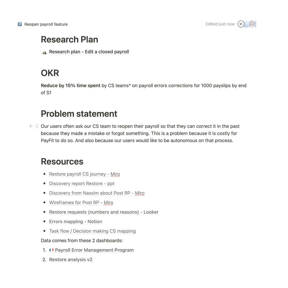
I embarked on a thrilling adventure at Payfit, collaborating with new Product Manager and Engineering Manager. Our OKR was set for us – to reduce the time spent by our Customer Support (CS) team on payroll error corrections by a challenging 15% within six months. As I was onboarding at PayFit, I used this project as a way to gain knowledge on our product and its user journeys by extending the research process.
Problem Statement
At Payfit, we recognized a recurring challenge faced by our users: the need to correct payroll after it had been closed. Often, these corrections arose from simple human errors or oversights. Users had to engage in a tedious back-and-forth communication with our CS team, resulting in a process that goes up to an average of 20 minutes per request. Not only was this time-consuming, but it also came with substantial infrastructure costs for the company. Prior teams had already delved into this issue, and our task was to deliver a feature that would empower payroll administrators and CEOs of small companies to independently edit their past payrolls – the “Reopen Payroll” feature.
Design process
As my PM and I start thinking about this requirement, we asked ourselves the following questions:
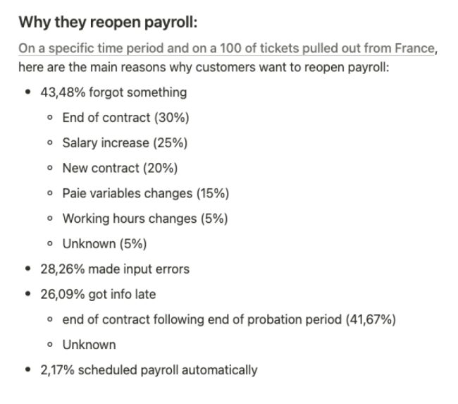
- What were the root causes of these errors? Where did they originate, how often and why did our users face this challenge?
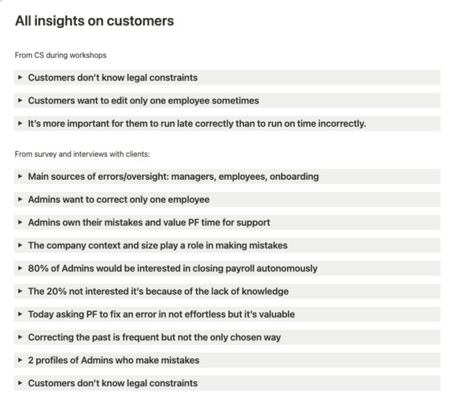
- Do users genuinely want the autonomy to reopen payroll? Do they feel all comfortable doing so?
- Is it legally viable to reopen a closed payroll? How to make sure we stay compliant?
Our preliminary research was instrumental in guiding us.
- We started by collecting data and evidence, utilizing the expertise of our data analyst team who gathered information into a Looker report. We plunged into a huge pile of useful resources created by different teams in the months leading up to this project to create our first assumptions.
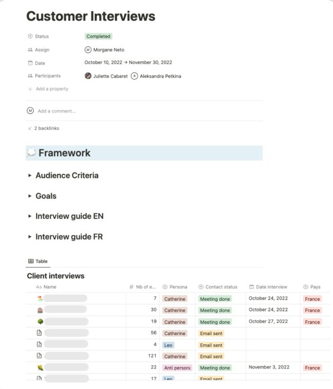
- While my PM was taking care of the legal and compliance topic, I observed and interviewed our CS team while they navigated the old, inefficient process. To gain a deeper understanding, I personally handled two customer cases. We also engaged with our users, interviewing 10 customers, including 5 payroll administrators and 5 CEOs, our 2 personas.
- Additionally, we conducted a survey in France, receiving responses from over 150 users. The goal was to check if there were any nuances for our users in the desire to be autonomous in reopening payroll.
- Simultaneously, another team was working on a project dealing with errors occurring after the social declaration had been sent to the social organisms. The legal impact is different from our initiative but the question arose – did our users perceive a distinction between correcting a payslip before or after this crucial step? We organized a design sprint, envisioning a unified experience and testing it with 10 participants.
The vision
From the design sprint, we came to the conclusion that, although the two initiatives are similar, payroll administrators who are experts in the field understand the difference, while non-experts like CEOs aren't quite familiar with the legal impact that exists after sending payroll to social organizations, and treat any corrections in the same way.
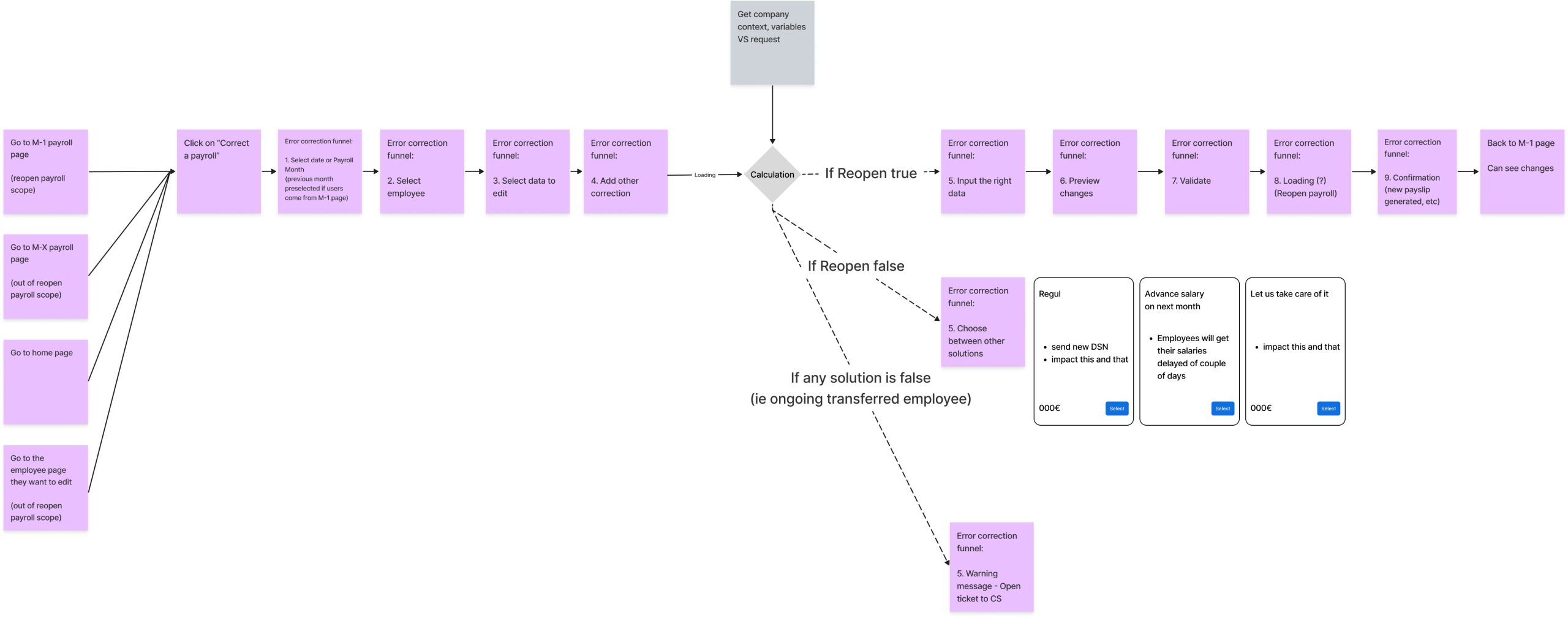
It gave us the vision for the ideal experience. Our concept is about giving our users the power to make decisions independently or with guidance. We will create a smart system that mimics our CS team's decision-making process using a sophisticated decision tree algorithm. This algorithm takes into account critical factors like dates, company size, and agreements, just like our CS team does. Then, it suggests tailored solutions for specific issues, such as fixing contract end dates or adding bonuses. This innovation will make the platform incredibly user-friendly, empowering users and improving their decision-making process.
My recommendations VS Reality
Based on our research, I proposed a set of recommendations:
- focusing on preventing errors: improving communication between managers/employees and the payroll team, auditing the email reminder experience, enhancing visibility on payroll cycles and essential dates,
- starting a service design exploration for improving the CS team's experience,
- enabling users to edit past payslips from the payslip page or other contextual actions,
- creating an algorithm to replicate CS decision-making,
- making past payroll visible for users to review their history,
- and providing a paid service for users who were uncomfortable with autonomous editing
However, many of these ideas proved impossible in a short term to implement due to technical constraints. In term of strategy, some of the points would be features or enhancements to be considered later on.
The MVP solution: Undo payroll
Meanwhile, we still had to deliver a solution for the end of semester to reach our OKR. After thorough exploration and discussions with the team, we decided to enhance the experience for our CS team instead of delivering a solution right away to end-users.
I conducted a workshop with CS and key stakeholders to establish a shared definition of “Undo Payroll for CS” and asked them to envision the ideal user journey. After refining these insights and requirements, I presented designs, engaging in design reviews with the Product Manager, CS team, and engineers.
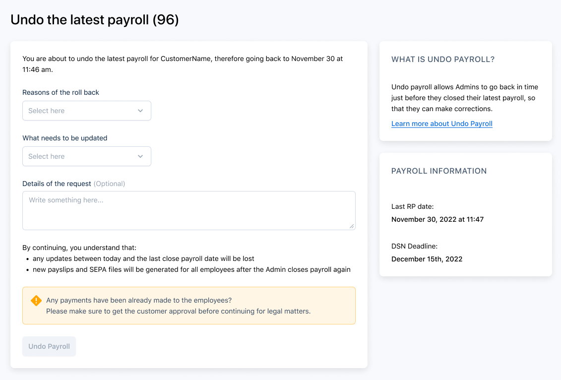
The Undo payroll solution aimed to:
- Empower CS to reopen payroll swiftly.
- Provide HR administrators with visibility into the ongoing payroll correction.
- Prevent the system from automatically reclosing payroll on the same day, offering users more flexibility and time to make corrections.
We successfully released this solution to the CS team in March 2023. It was well-received and we reached in 2 months almost a complete adoption. But most importantly, it significantly reduced the time spent by CS on error corrections, marking a success.
≈90%
ADOPTION RATE
FROM CS
15min
TIME SAVED / REQUEST
BY CS TEAM
Expanding to End-Users
The journey didn't stop there. Our goal was to put this powerful tool in the hands of our end-users – HR administrators and CEOs of small companies. However, we faced new challenges:
- Each country had its unique payroll experience, coded in a proprietary system, Jetlang.
- The rest of the platform was global and coded in React.
The technical challenge lay in finding a way to trigger this feature, as there was no global payroll page shared among countries. We couldn't design something for one country and expect it to work seamlessly for others. Our solution was to design a payroll widget on the dashboard, allowing users to access the “Reopen Payroll” feature. We aligned quickly with different teams, including the dashboard designers, and engaged in a co-design session.
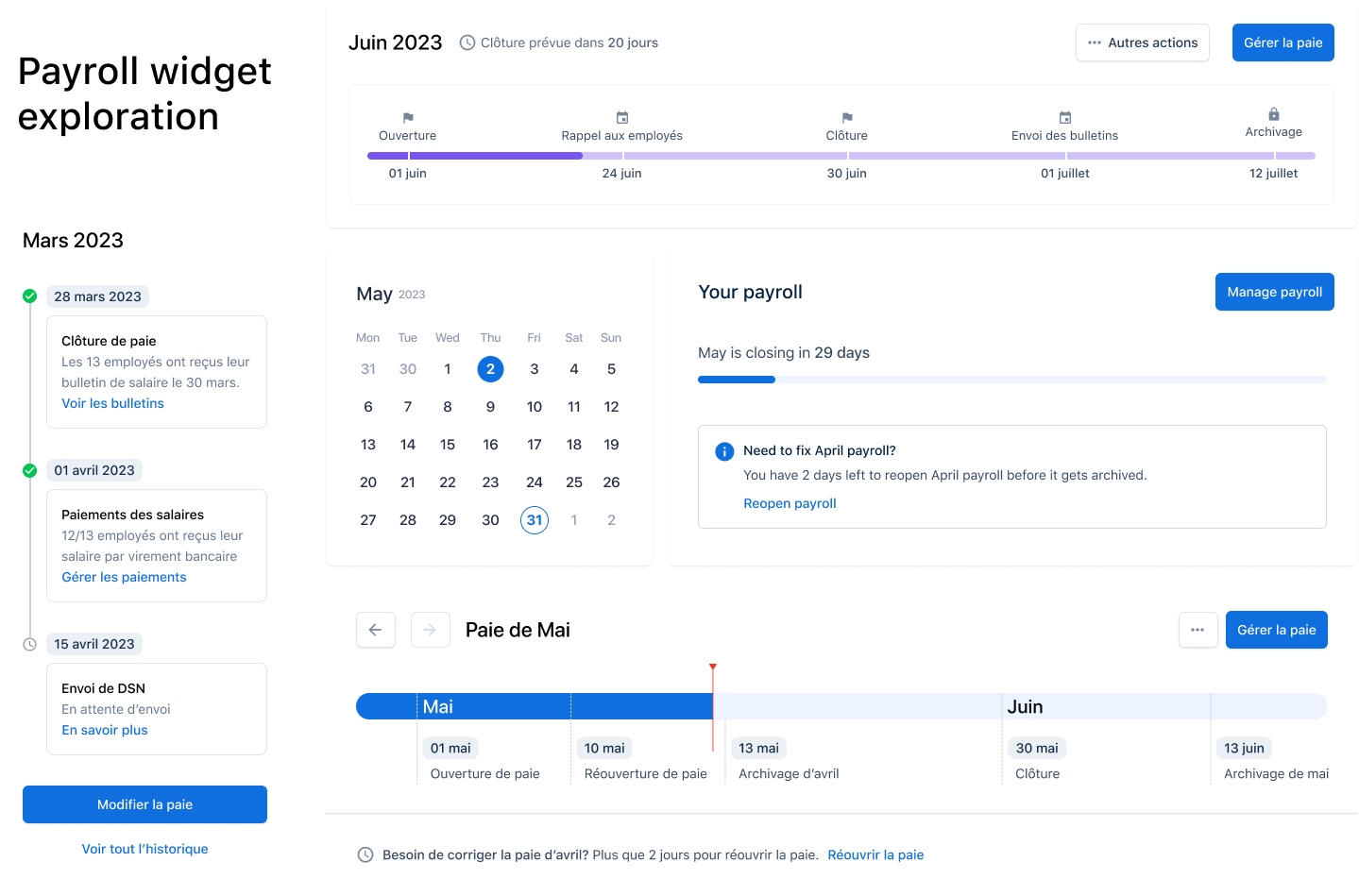
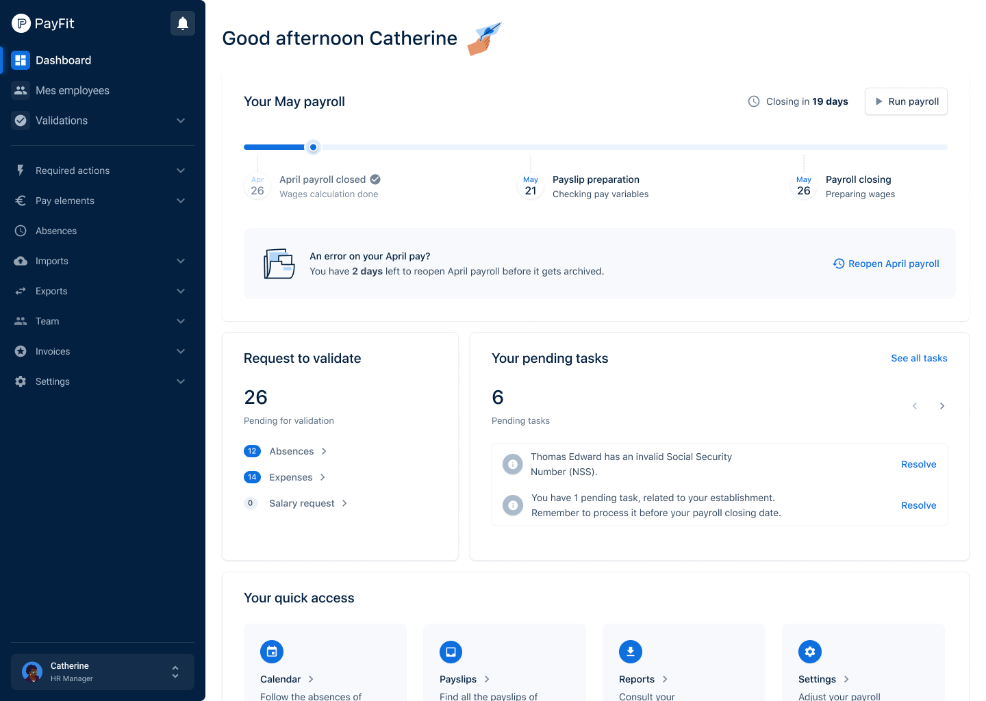
The final design included:
- A payroll widget on the dashboard, offering an overview of the payroll and the option to reopen the previous one.
- A first-time usage flow to ensure users understood the feature.
- A list of use cases to guide users through the solution.
- A banner indicating when payroll was being reopened.
- A confirmation state once the process was completed.
We released this feature to a selected group of customers, specifically French SMBs, and tested it with five users to validate our direction.


