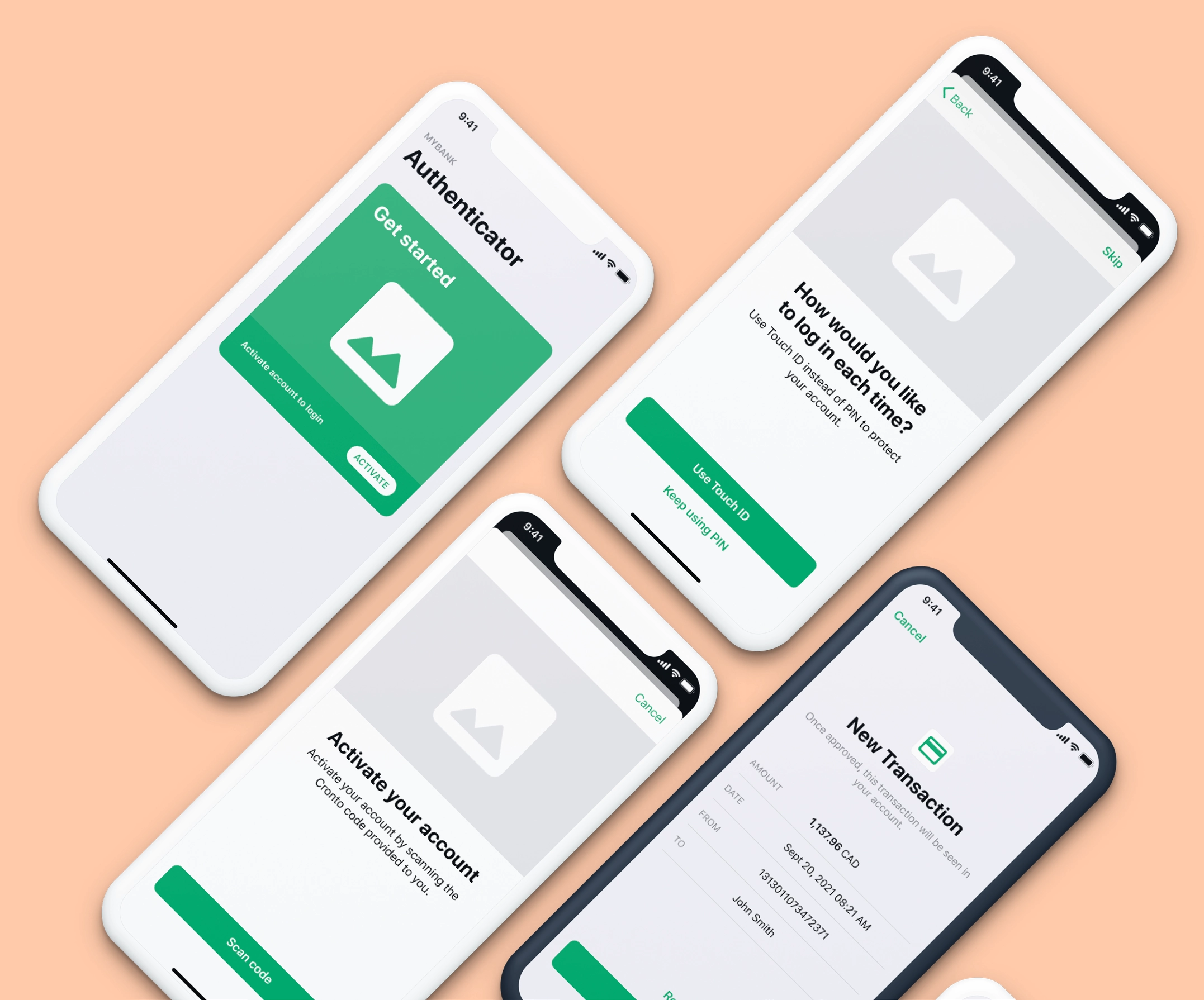
—– REDESIGN OF white-label two-factor authentication app
The most challenging part of this redesign was that it’s a white-label application that OneSpan offers to banks, so colors, graphic elements and text can be customizable.
As well as features and flows which can be enable or not.
So the experience would be different for a bank who would only offer Push notification authentication to their users, versus a bank who would have scanning QR code as an authentication method.

— User Research
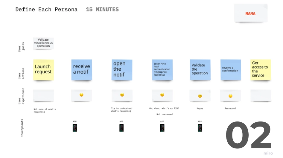
01-02 : Leading a proto-persona workshop with POs, sales people and the UX researcher. Based on this and on additional researches, the UX Researcher created user journeys and personas.

— Problem statements
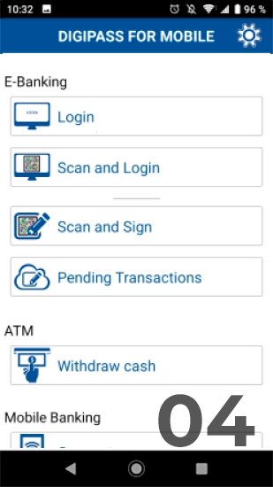
• There is no prioritization of actions, all the actions users can perform from the main screen are at the same level which is confusing for users. On top of that, buttons to perform these tasks don’t look like buttons. We should emphasize primary action, reinforce affordance and follow standards to reduce the cognitive load
• Users don’t feel the app is easy to use. Also, the help/guidance is only available on the Welcome screen, so users have to go back for troobleshooting. We should adopt a more natural language, explain technical terms and guide users using contextualized help.
• Activation and authentication processes are not intuitive and too technical “what is this code, where do I have to enter it?”
• Users go through too many steps during the activation process. Some of these steps are permissions for which the benefit is not explained to users. Also, the permissions are not asked at the right time during the experience which leads to users being less inclined to grant permissions.
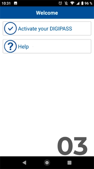
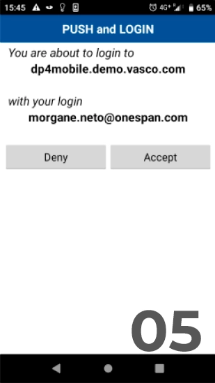
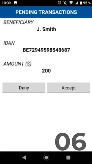
03-06: MAS screens before the redesign

— Design
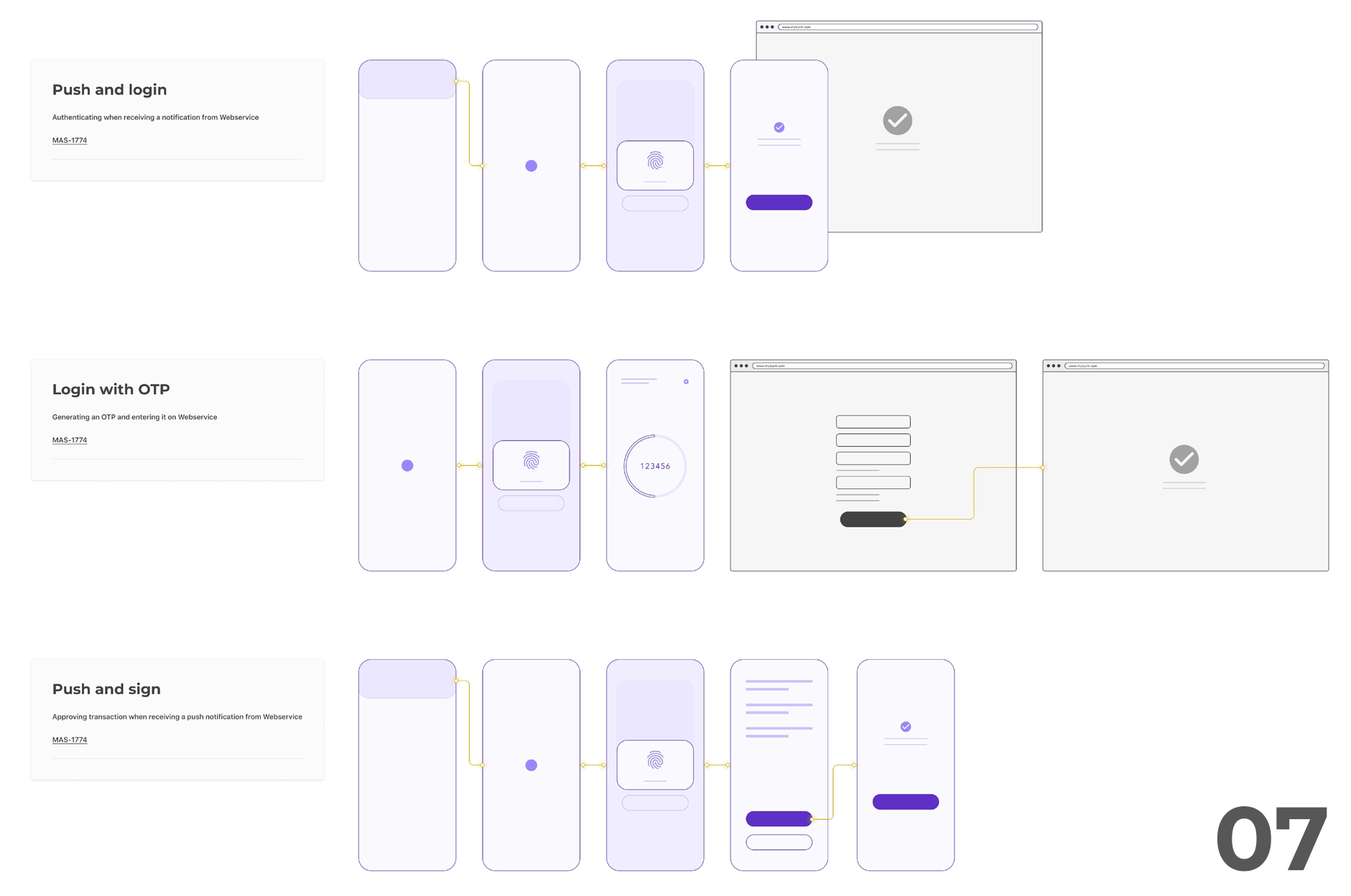
07: User flow proposals
— Prototyping for usability testing
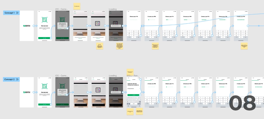
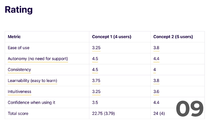
08: Figma prototypes | 09 : Extract from the Usability testing report that I used to iterate

‘’Overall setting it up was pretty easy, but understanding the main page with the authenticator was a little bit confusing.‘’
Answered a participant after the usability testing when the UX Researcher asked if the app was easy to use.
+ 65
screens designed
2
prototypes tested
7
user flows mapped


