AIR FRANCE PRESS
UX DESIGN & STRATEGY OF A MOBILE APP
Year
2016
Client
Air France
Role
UX Designer Intern
Scope
UX Design
Strategy
Mission
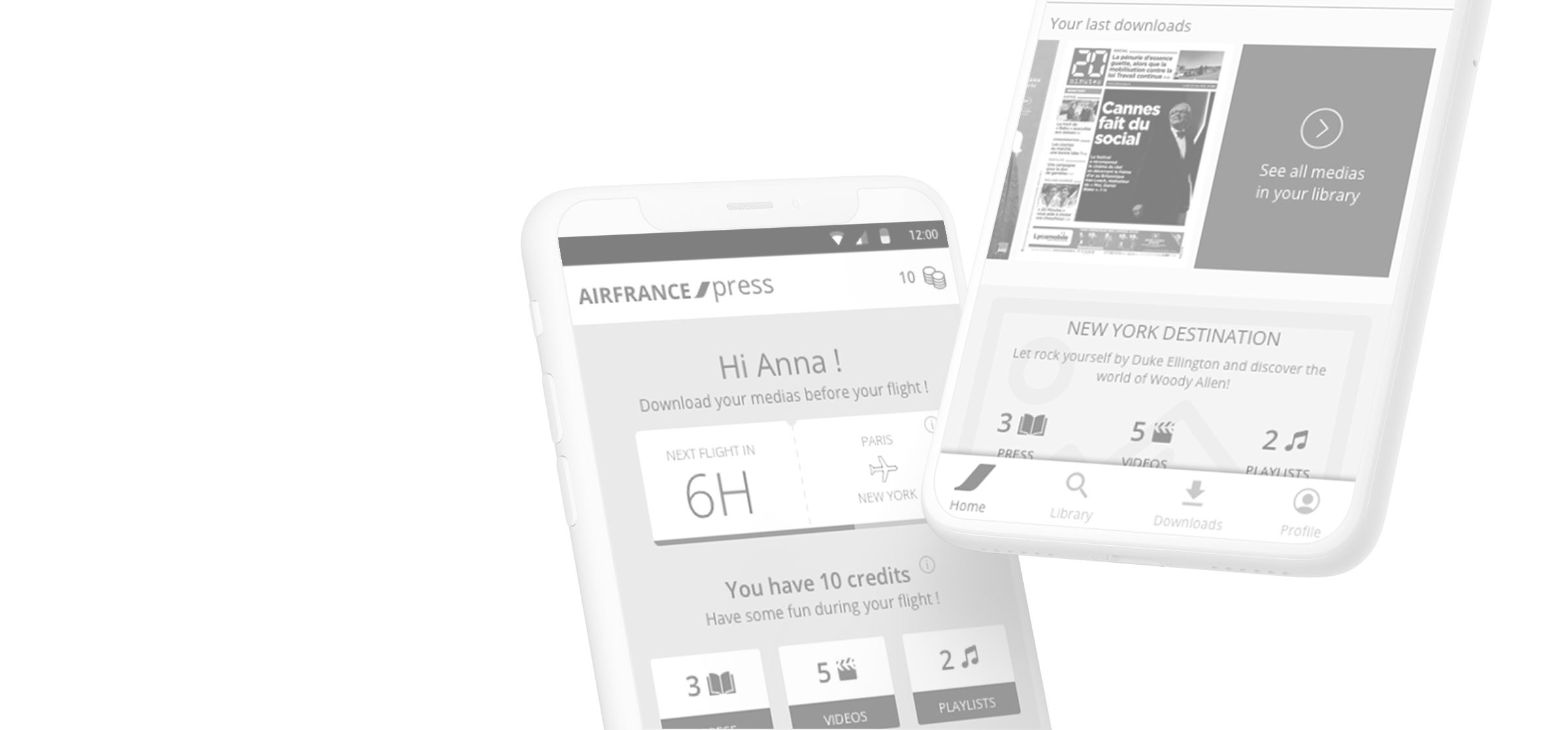
Air France has called upon the expertise of Akiani, a user-centered design and human factors consulting agency, where I completed my end-of-year internship. The airline has assigned us the task of suggesting improvements for the mock-ups of the new version of the Air France Press application.
Audit of the experience
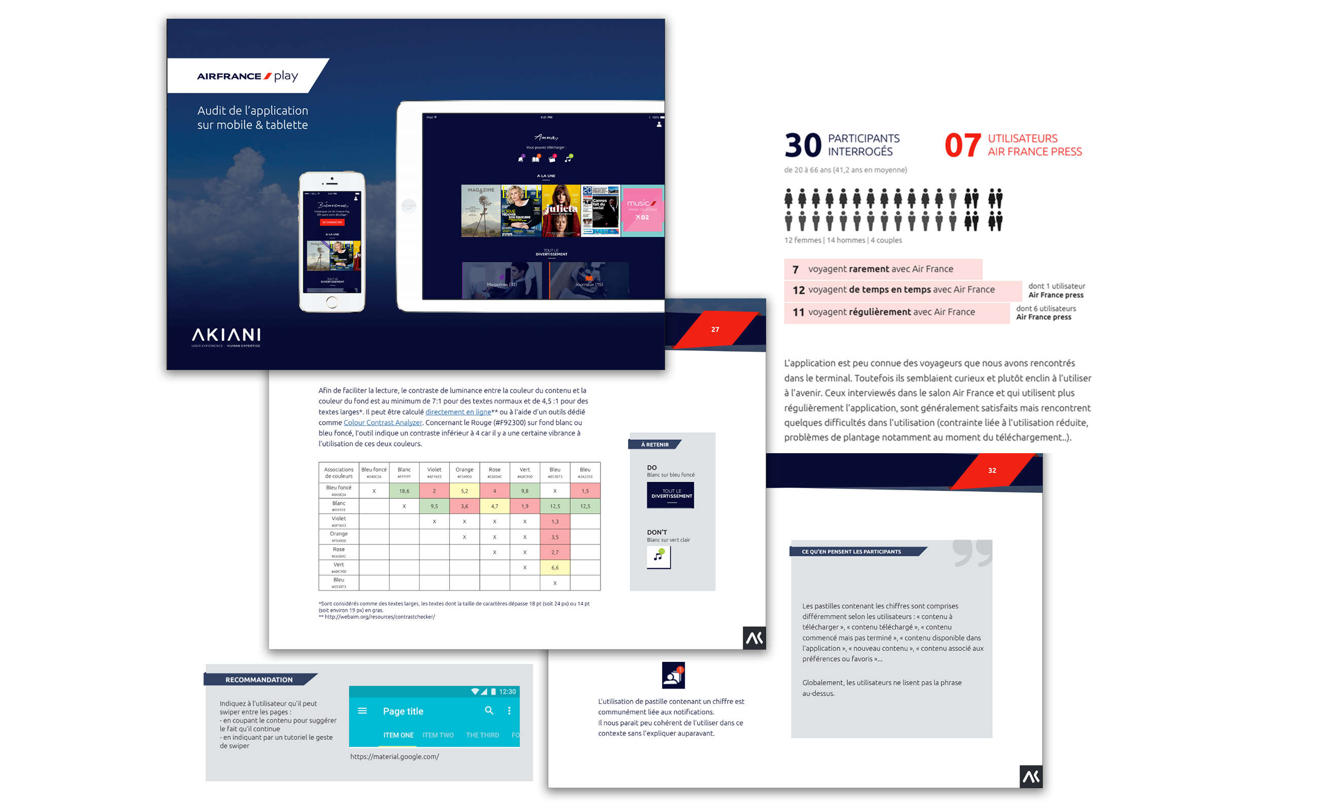
The first step involves conducting an audit. This entails examining all the screens of the application and the interactions to identify any potential issues related to usability and user-friendliness. I delivered 50-page audit report. To do so, I relied on established best practices and recognized mobile ergonomics criteria, as well as the Android and iOS guidelines.
Extract of the audit report made for Air France
User testing at the airport
I first created our script and prepared a dynamic prototype using Principle for Mac. I then used this prototype for “guerrilla” testing with users. Guerrilla testing involves approaching users informally and engaging them in conversation. The idea is to present them with a primary scenario and ask them to verbalize their actions and thoughts. Depending on how this initial part unfolds and the user's comfort level, it's possible to suggest conducting one or more additional scenarios and/or addressing questions about the application being tested in order to clarify any doubts about user understanding of certain elements.
Problem framing and solutions
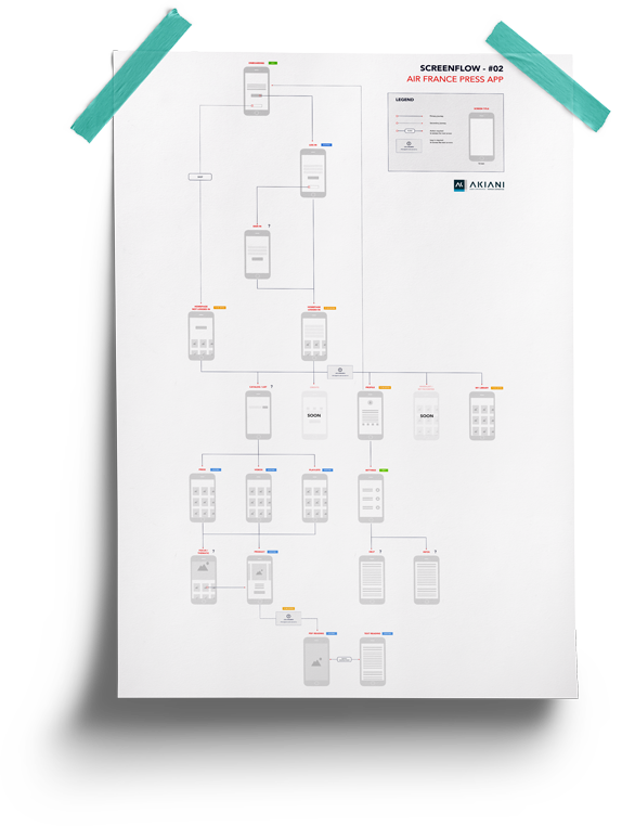
Proposal for a new Information Architecture:
One of the initial issue we noticed during the audit was the complex navigation between the screens. The was confirmed by the usability testing we performed at the airport.
New UI/UX:
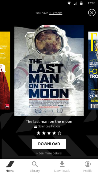
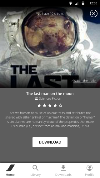
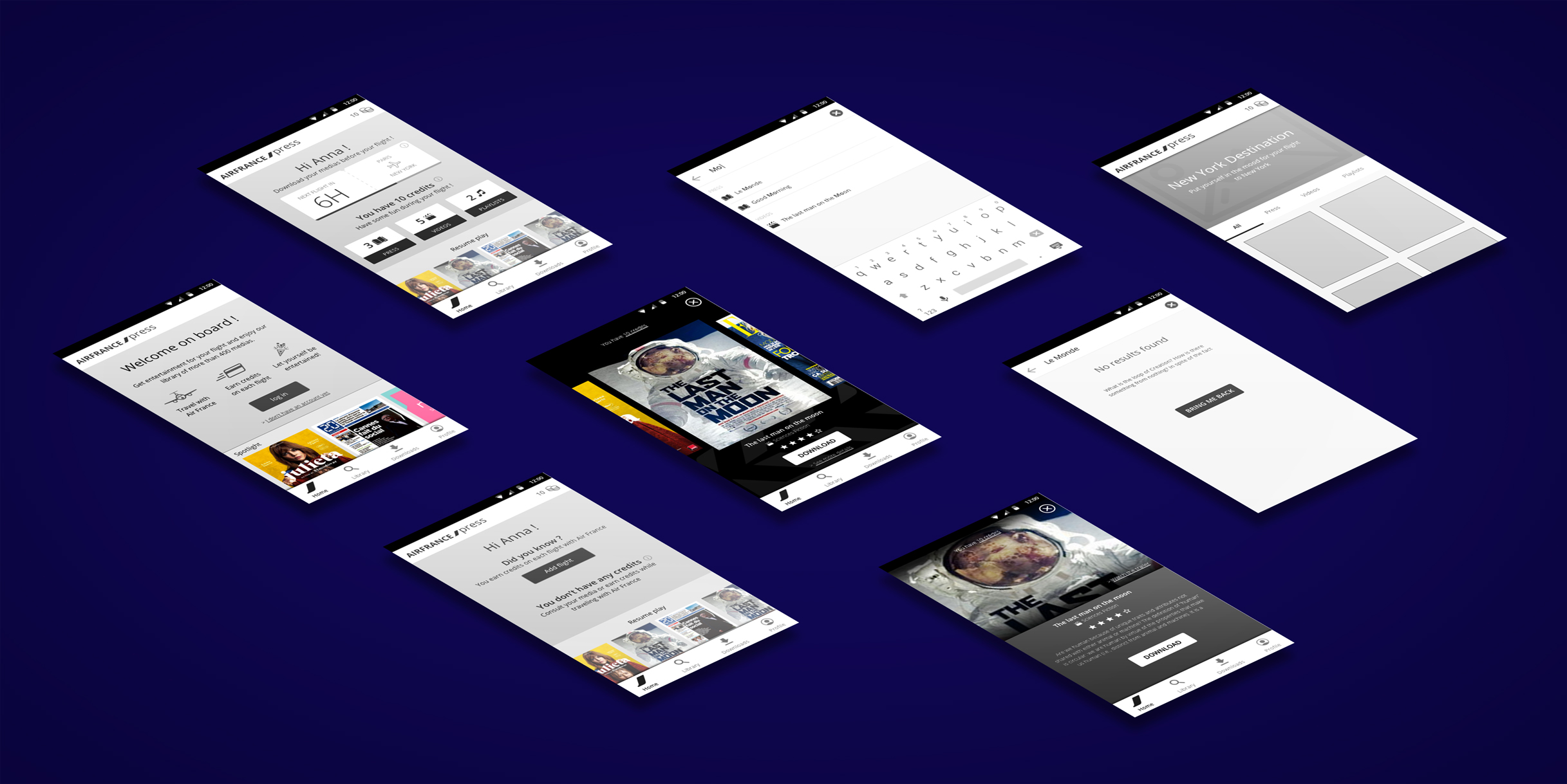
Another problem with the mock-ups we received was that they were designed like a mobile website (e.g., featuring a footer). Key elements of the mobile application were missing (such as a navigation bar with settings and account options), which became evident during the testing. Therefore, we decided to suggest new screens that align with user expectations.
50
PAGES FROM
THE REPORT
5
HOURS
OF TESTING
8
WIREFRAMES
CRAFTED

“Long, stressful, boring, uncomfortable, cramped, tiring, scary” are the most recurrent words used by travelers to describe their experience on a plane.

Going a bit further
During our research, several strategic questions arose regarding the use of this application. That's why I decided to focus my professional thesis on this topic, specifically on how to integrate the use of an entertainment application into the travel experience at the airport and on the airplane, which can sometimes be challenging and even stressful. For the curious, I published an article on Akiani’s blog about How the in-flight entertainment should be included in the traveler experience (in french).


